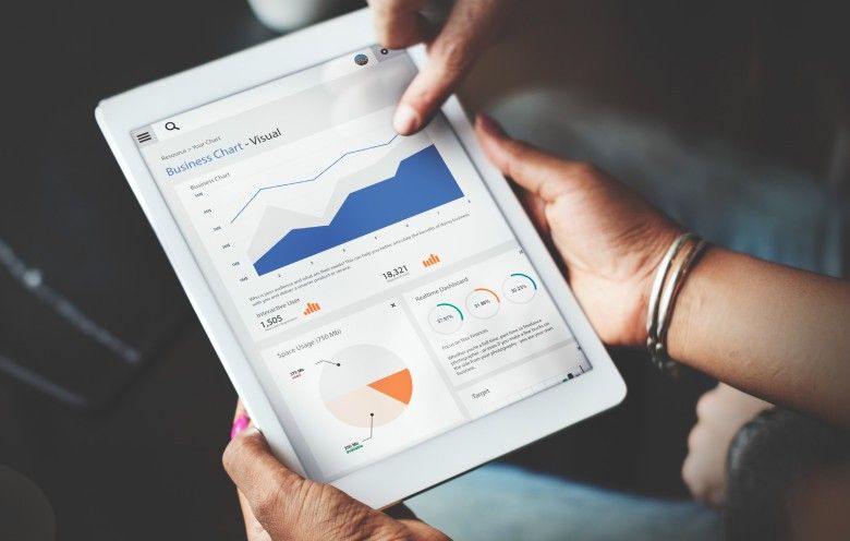
Data is becoming the language of smarter decisions. And the way we visualize and interact with data is changing fast. Artificial Intelligence (AI) has become the engine that drives insight discovery. The integration of AI with data visualization is providing better means of understanding data by enabling analytics platforms to convert static dashboards into intelligent, interactive systems. These dashboards identify patterns, predict outcomes, and recommend actions.
Alongside AI-driven dashboards, real-time analytics powered by edge computing is closing the gap between data generation and decision-making. As a result, organizations can respond faster to market fluctuations, operational issues, and consumer behavior.
75% of analytics content will use GenAI for enhanced contextual intelligence by 2027. Source: Gartner
GenAI adoption in analytics points to a major shift in how data is visualized and consumed. In this blog post, we’ll explore the top data visualization trends that are restructuring how businesses comprehend their data. From AI-powered dashboards that break down complex information, to real-time visuals that update as conditions change, these data analytics and visualization trends are changing the business paradigm.
7 data visualization trends for 2026 redefining business intelligence

Data visualization trends represent more than incremental improvements. They are fundamental shifts in how organizations extract value from data.
1. AI-driven data visualization dashboards
These dashboards function as analytical tools that monitor data streams, identify anomalies, and provide insights. They understand context, identify patterns across various data sources, and modify visualizations as per user behavior and business requirements.
Modern AI visualization platforms analyze data relationships and highlight statistically significant findings in natural language summaries. They adapt chart types and visual encodings based on the data characteristics and the questions being asked, ensuring clearer understanding. Predictive overlays show future trends directly within historical visualizations to provide a complete temporal view.
2. Autonomous analytics agents
These agents represent the evolution from reactive to proactive business intelligence. They operate independently and analyze enterprise data to identify opportunities and risks. And trigger alerts before issues escalate or opportunities are lost. Autonomous agents understand business context and adjust their monitoring conditions as situations change.
Autonomous analytics agents combine natural language processing, machine learning, and domain knowledge. They can inspect data irregularities, cross-check multiple data sources, and run what-if scenarios to understand causation. When revenue falls, an autonomous agent may trace it back to factors such as supply chain delays, regional weather trends, and competitive pricing changes without requiring human intervention.
The agents work continuously, monitoring thousands of metrics simultaneously and applying advanced logic that otherwise would require entire team of analysts.
3. Real-time visual dashboards with edge computing
Edge computing has removed the latency issues that affected real-time visualization. It processes data at or near the source, for instance on IoT devices, local servers, or regional data centers. Edge-enabled dashboards update with millisecond precision rather than minutes or hours. This architecture is critical for scenarios where immediate visibility drives operational success, like manufacturing floor monitoring, supply chain tracking, financial trading, and customer experience optimization.
Real-time visualization at the edge combines dispersed computing with intelligent data filtering. Edge nodes perform initial aggregation and analysis and send only relevant updates to visualization layers. This reduces bandwidth requirements while maintaining complete operational visibility. Edge computing makes visualization operationally decisive.
4. Natural language querying and conversational analytics
Conversational analytics interfaces are removing the technical barriers between business questions and data answers. Users interact with data visualization platforms using natural language, asking questions like “show Q4 revenue by region,” and receive immediate visual responses. Natural language interfaces allow non-technical stakeholders to explore data independently without technical knowledge.
Advanced NLP engines analyze queries, understand context and intent, infer the relevant data sources and metrics, and generate visualizations. These systems clarify follow-up questions and learn from user interactions to improve accuracy. Conversational threads allow users to refine analyses using dialogue and create exploratory workflows.
Organizations that adopt conversational analytics see increases in data engagement among their non-technical teams. Marketing managers analyze campaign performance directly, operations leaders investigate bottlenecks without IT support, and executives explore scenarios during meetings without pre-built reports.
5. Modular and decoupled visualization architecture
The growing complexity of enterprise data ecosystems has compelled organizations to move toward modular, decoupled visualization architectures. With this development, organizations can upgrade, scale, and modify every layer of their visualization stack without affecting the rest of the system.
Decoupled architectures separate data connectivity, transformation logic, analytical processing, and visual rendering into distinct microservices. Visualization layers connect to data through standardized APIs, allowing smooth integration with different data sources such as cloud warehouses, streaming platforms, operational databases, and external APIs. Standardized API connections support headless BI developments where visualizations can be embedded into custom applications, portals, and operational tools.
6. Multi-modal dashboards
This type of dashboard represents the convergence of diverse data types and interaction techniques into unified analytical experiences. It integrates old, structured data visualizations with unstructured content such as video feeds, audio streams, images, text documents, and sensor data, creating detailed operational views that show the complexity of modern business environments.
Multi-modal visualization supports contextual integration. These dashboards use advanced technologies, including computer vision for image analysis, speech recognition for audio data, and natural language processing for text interpretation, all feeding into corresponding visual interfaces. The interaction models also expand as users navigate using voice commands, gesture controls, and traditional clicks, choosing the most natural method for their context.
7. Scalable data mesh ready visualization
Data mesh architecture is transforming how large organizations manage analytics, and visualization systems are adapting accordingly. Data mesh treats data as a product owned by domain teams across the organization. Visualization platforms designed for data mesh environments enable discovery, access, and analysis of distributed data products without requiring centralized consolidation.
Data mesh ready visualization tools provide query capabilities that access data across domains while respecting ownership boundaries and governance policies. They incorporate metadata-driven discovery mechanisms that allow users to find relevant data products through business context in place of technical schemas. Built-in data quality indicators and lineage tracking ensure users understand data origin and trustworthiness before utilizing it for analyses.
This architectural shift addresses scalability challenges. As organizations grow and data volumes expand exponentially, data mesh with compatible visualization enables linear scaling. Each domain manages its own data products and analytical capabilities without creating bottlenecks.
Industry-wise use cases of data visualization

Trends are valuable only when they create real business impact. Here’s how different sectors are applying these trends in practice.
1. Finance and banking
Banks and financial establishments use real-time dashboards to examine transactions, fraud alerts, and investment performance. Data visualization helps them identify issues and meet compliance standards. For instance, risk dashboards help visualize fraud patterns in milliseconds using AI.
2. Healthcare
Healthcare companies use predictive dashboards to examine patient data, treatment progress, and operational effectiveness. Data visualization turns complex datasets into insights that help teams deliver better patient care. It helps them make informed decisions. For example, patient outcome dashboards display real-time vitals and resource usage.
3. Retail and e-commerce
Data visualization tools help retailers analyze customer behavior, product trends, and marketing performance. These tools merge data from online and offline channels and help improve sales and customer retention. One such example is an interactive sales dashboard that displays sales by region, category, and campaign ROI.
4. Manufacturing and supply chain
Real-time visualization helps companies track production, machine condition, and logistics. Dashboards combine IoT data to help minimize downtime and predict demand. For example, smart factory dashboards that display equipment efficiency and energy consumption.
How can we help you build future-ready visualization systems
We help reveal the correlations and trends hidden in raw data. By applying advanced computation and dynamic visualization frameworks, we convert complexity into clarity that drives innovation, efficiency, and measurable outcomes.
| Service | What we do | Business value |
|---|---|---|
| End-to-end data visualization development | Connect your data sources and design intuitive dashboards | Interactive, secure, and scalable dashboards |
| Scalable cloud architecture | Build cloud-native dashboards on AWS, Azure, or Google Cloud | Fast, secure, and continuous access to insights across teams |
| AI and predictive insights | Integrate AI and ML models | Decision-makers see what’s coming and take proactive actions |
| Data governance and security | Every dashboard follows strict data governance and privacy standards | Reliable, secure insights for critical business decisions |
| Custom dashboards for every department | Tailored dashboards for sales, marketing, operations, finance, and other teams | Organization-wide alignment with data-informed, decision-ready teams |
| Design and user experience that drives action | Clean, easy-to-read visualizations focused on clarity and usability | Faster insight discovery and higher adoption rates |
Turn data into decisions today to prepare for the future
The data visualization trends shaping 2026 are the operational realities that organizations are implementing. The gap between the success of businesses that utilize smart, real-time, conversational analytics and those depending on static reporting is increasing quickly, translating directly into market share, operational efficiency, and customer satisfaction distinctions.
The challenge isn’t about making changes to your data visualization capabilities, but about how fast you can deploy technologies that convert your data into actions. Your competitors are already viewing, interpreting, and deciding faster. The infrastructure you develop today will determine whether you will lead or follow the market driven by data.
FAQ’s
1. What is data visualization, and why is it important in 2026?
Data visualization is the practice of turning data into visual formats for easier understanding. In 2026, it becomes vital because businesses rely on faster insights, real-time decisions, and clearer ways to interpret complex, growing datasets.
2. How are AI dashboards changing the business of data?
AI dashboards automate analysis, update insights instantly, and present information in intuitive visuals. They reduce manual effort, highlight patterns early, and make advanced analytics accessible to all teams, reshaping how organizations work with data.
3. How can data visualization help a business grow?
Data visualization supports business growth by revealing trends, identifying risks, improving decision-making, and helping teams understand customer behavior. Clear visuals turn raw information into actions, enabling companies to move faster and compete more effectively.