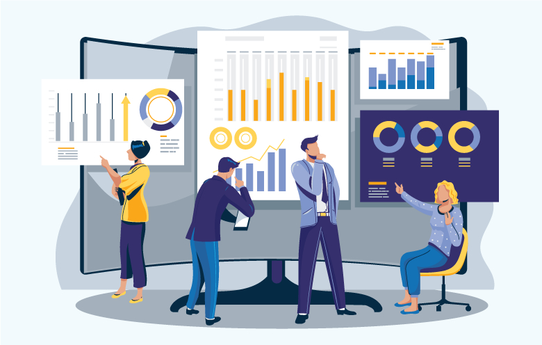
Data visualization refers to the representation of data in a visual format like a graph or a chart. It explains the association of data with images to show the trends and patterns easily.
Good data visualization conveys a story to the audience through images, graphs, or charts in easily comprehensible language and ideas. A combination of the right choice of data, appropriate data visualization format, accurate data representation, uniformity in scales and explicit color of visuals make a good data visualization. It should engage the reader and grab their attention. Most importantly, the format of data visualization must direct the reader to understand what and why of the visual easily to draw insights.
Visual inputs help us to gauge things quickly. For example, when drivers see the danger signs on hilly and curvy roads, they immediately lower the speed and become more conscious while driving. In the same manner, charts and graphs make it very easy to understand and act on the provided information instantly.
Types of charts and graphs
To understand why we need good data visualization, we need to understand how a bad representation of data affects your business. Well, bad visualizations can lead to wrong decisions and hinder the performance of your business. Bad data visualization happens due to bad data, inappropriate choice of data visualization, excessive color or wrong representation of data and irregular scales. Hence, to prepare a better data visualization chart or graph, we have to take care of these things efficiently.
While choosing data visualization services, you must aim for a scalable BI service that would efficiently cater to your business scale and analytical requirements. Moreover, there are a lot of data visualization tools available in the market. Let’s take up a few of them in brief:
Tableau
Tableau has several data visualization products and it holds the entire ecosystem for business intelligence. Tableau integration provides a data visualization tool and data preparation instrument that helps to transform, clean and map information even without code knowledge.
Tableau features:
- Drag & drop user interface
- Huge list of native integrations along with data sources
- Shareable access to analytics
- Report embedding
- Cross-platform access
- Server REST API
- Regularly updated data flow
- Metadata management instrument
- Inbuilt dashboard commenting and highlighting
Microsoft Power BI
Microsoft Power BI easily integrates with your current business environment. It allows you to adopt analytics and reporting abilities. You can customize Power BI dashboards as per your business requirements. Microsoft offers its software for free through which, you can achieve full functionality, but all the produced reports are published to the Microsoft Gallery and made publicly visible.
Power BI features:
- Drag & drop interface
- Desktop application
- An extensive list of native integrations and data sources
- Customizable reports
- Incremental data updates
- Full BI ecosystem
QlikView
QlikView offers great flexibility to teams that are involved in building customized software. It is a freemium version that can be upgraded to Qlik Sense.
Qlik features:
- Customizable reports
- Role & permission-based access system
- Open API
- Open database access
- Cross-platform access
- Shareable access to analytics
Let’s go through a list of the most widely used charts and graphs to use them efficiently:
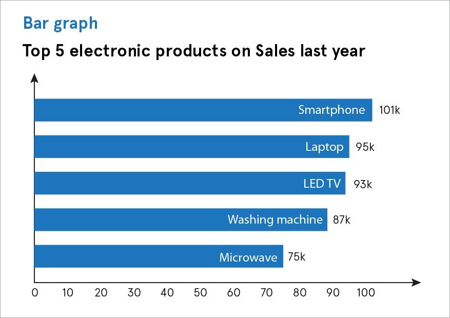
Bar graph
Bar graphs are horizontal column charts that are mostly used when data has to be segregated and displayed in several categories. It helps to avoid clutter and compare data easily. You can highlight differences and show patterns or even reveal negative numbers using a bar graph.
Bar graphs are mostly used to compare objects and represent numeric information.
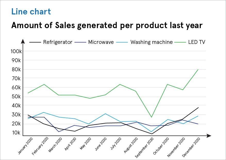
Line chart
A line chart is used to show trends in data over a period of time. It connects multiple data points and presents them as a continuous progression and helps you to visualize variations in values in comparison to one another.
Line charts are often used to display the object value on the timeline and illustrate trends over time.
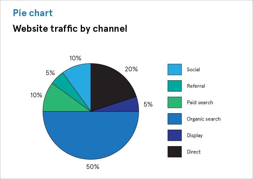
Pie chart
A pie chart is used to represent numbers in percentages, the total of which has to be 100%. It shows static numbers to display several categories individually as a part of what you display. You can add detail to other visualizations using a pie chart as well.
Pie charts are mostly used to show the composition of one object or a comparison of its parts with the whole object.
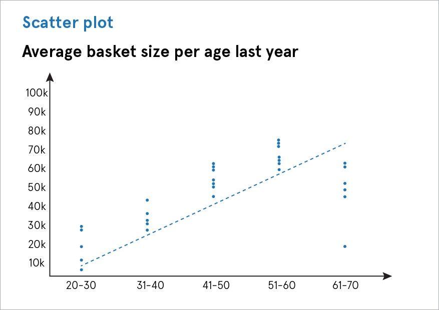
Scatter plot
A scatter plot shows the association between two different variables. It displays whether different variables are dependent on each other or not. It is used to present multiple discrete data points on a single chart. You can use it to look for deviation and comprehend your data distribution. It helps you to emphasize similarities in the data set.
Scatter plots are used to show the distribution of objects and state their qualities.
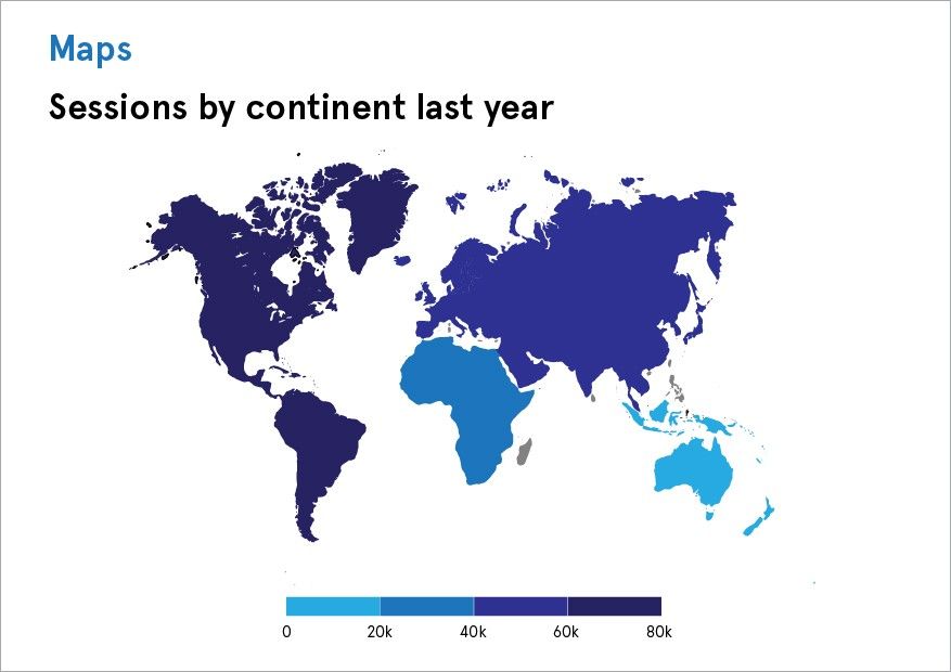
Maps
Map charts are used to display numbers in a geographical context. It becomes easy to notice the performance of different areas ranging from best to worst using a map chart. Maps can easily show the correlation between different data sets of coordinates, countries, states, etc.
Maps are used to visualize geographic data by location.
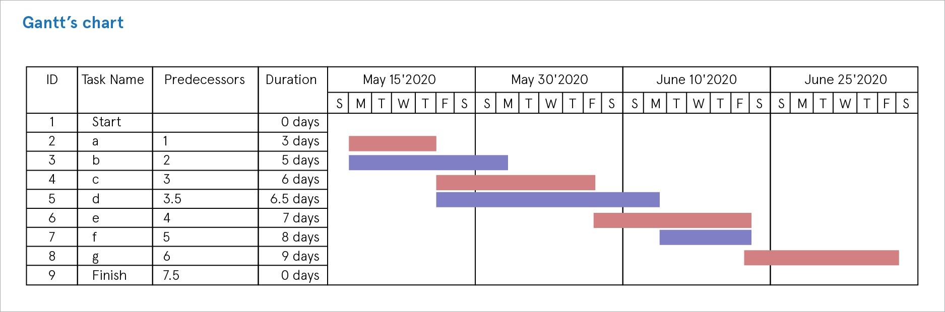
Gantt’s chart
Gantt’s chart is used to display planning and scheduling projects and reflect progress overtime. It is a map of projects that pictorialize action in order, including the timeframe and resource allotment. It also shows the time in which a project must be completed and the dependencies of a task upon other tasks.
Gantt’s chart can be used in the rental businesses to display items for rent along with their details.
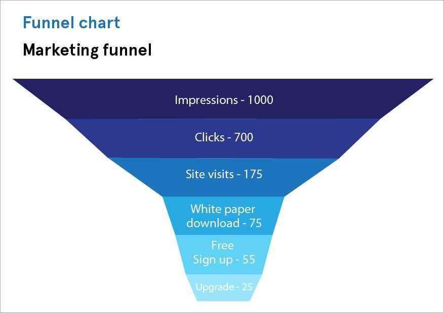
Funnel chart
Funnel charts are the best way of showing narrowing correlations amid groups. It shows a series of steps and the completion pace for each step. Funnels utilize geometric and color coding to distinguish between different items.
Funnel charts can be used to show different stages of a process with the decreasing percentage of objects.

Bubble chart
A bubble chart is used to add another dimension to a scatter plot chart. It can easily display the association between three or more measures. Where the scatter plots are used to compare two values, bubble size is added as the third variable to compare the values. You can create visually convincing charts that present a great volume of data by altering the size and color of the circles.
A bubble chart would be a great choice to show market spending in comparison to the revenue generated and profit earned.
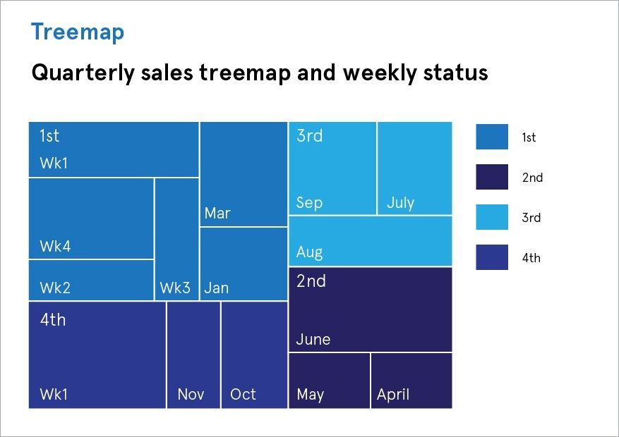
Treemap
Treemap is useful when you have a lot of data to visualize. It relates dissimilar segments of your data to the whole. It also displays information as a bunch of rectangles changing in size and color, as per their data value. In a treemap, the size of rectangles reflects the quantity and the color displays the value or a group. Treemap helps you to observe trends and make comparisons.
A treemap is often used to represent categorical data.
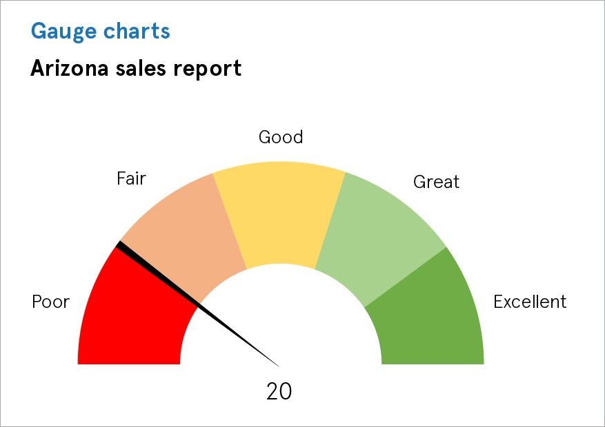
Gauge charts
Gauge charts, also known as speedometer charts, compare two values on a scale. They are used to make a comparison between current and target values showing progress or decline in the performance. These charts use needles and colors to illustrate data compared to reading on a dial/speedometer, providing an easily perceivable visual.
Gauge charts are used when you have to track multiple metrics and visualize specific data points.
The final say
There are multiple ways to represent data, tools and technologies that can help you in charting and graphing data for a good visualization. But when it comes to building, maintaining and enhancing the visuals, it requires business intelligence. There are innumerable data visualization ways and they depict differently, but impactful data stories. However, for great data visualization, you have to find the best match to display your data.
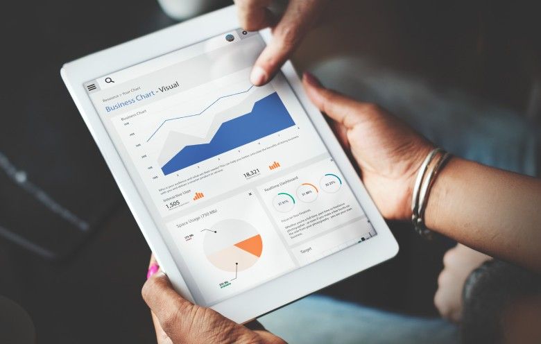
Data visualization is not just about using colors and icons, but it is about putting all your data together on a BI analytics dashboard using a data visualization tool to make the readers understand how their business is performing. Contact our BI experts to help you create insightful visualizations for your enterprise.